
ROOTS CANADA PROPOSAL RESEARCH
Sector Humber college UXD 5112
My role UX DESIGNER/ UX RESEARCH
Project time 3 Weeks
Challenge Users are not converting as much as they used to from Roots Canada website and mobile version.
PROBLEM
Roots Canada observed a notable 17% decline in online sales across both desktop and mobile responsive platforms. This reduction has resulted in fewer customers successfully finding products and completing their purchases online.
OBJECTIVE
This research plan aims to investigate the underlying reasons for the decrease in online purchase completions and identify potential areas for improvement.
I initiated my research by conducting a comparative analysis of the desktop and mobile versions of Roots Canada’s website. Subsequently, I examined the strategies and performance metrics of competitors such as Old Navy Canada to identify discrepancies and understand why Roots Canada’s results may differ.
RESEARCH
PLAN SCREENER: 40 DAYS-NOVEMBER-DECEMBER 17-26

COMPETITOR COMPARISON

DESKTOP VS MOBILE VERSION

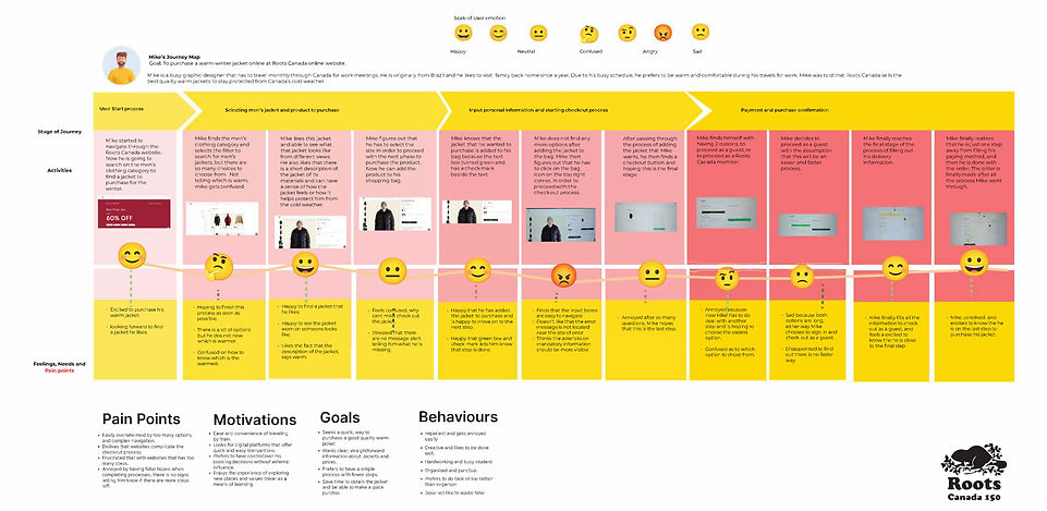
JOURNEY MAP
ORIGINAL USER FLOW OF ROOTS CANADA

PROPOSED USER FLOW OF ROOTS CANADA

PROPOSED SOLUTION PROTOTYPE
The objective of the new process is to address a 17% decline by identifying factors contributing to this decrease. The goal is to streamline the Roots Canada online purchasing experience, reducing the number of steps required for customers to complete their transactions. This enhancement will simplify the checkout process, making it more efficient and user-friendly, there by improving the overall customer experience. The revised process removes one step compared to the original, which is expected to accelerate the purchasing flow and increase conversion rates.
To streamline the checkout process, I propose adding a "Checkout" button directly beneath the "Add to Bag" button, which will appear after a user adds an item to their cart.
This allows customers to proceed to checkout immediately, without needing to navigate to the shopping bag icon.
The shopping bag icon will remain available at the top of the page for users who wish to review or edit their order. This approach ensures a more intuitive user experience by providing a clear, immediate option to advance to checkout, minimizing any potential uncertainty about the next steps.
